Matium Matter
Building the design system that made Matium's product scalable, and closing the gap between Figma and production.
Impact
Overview
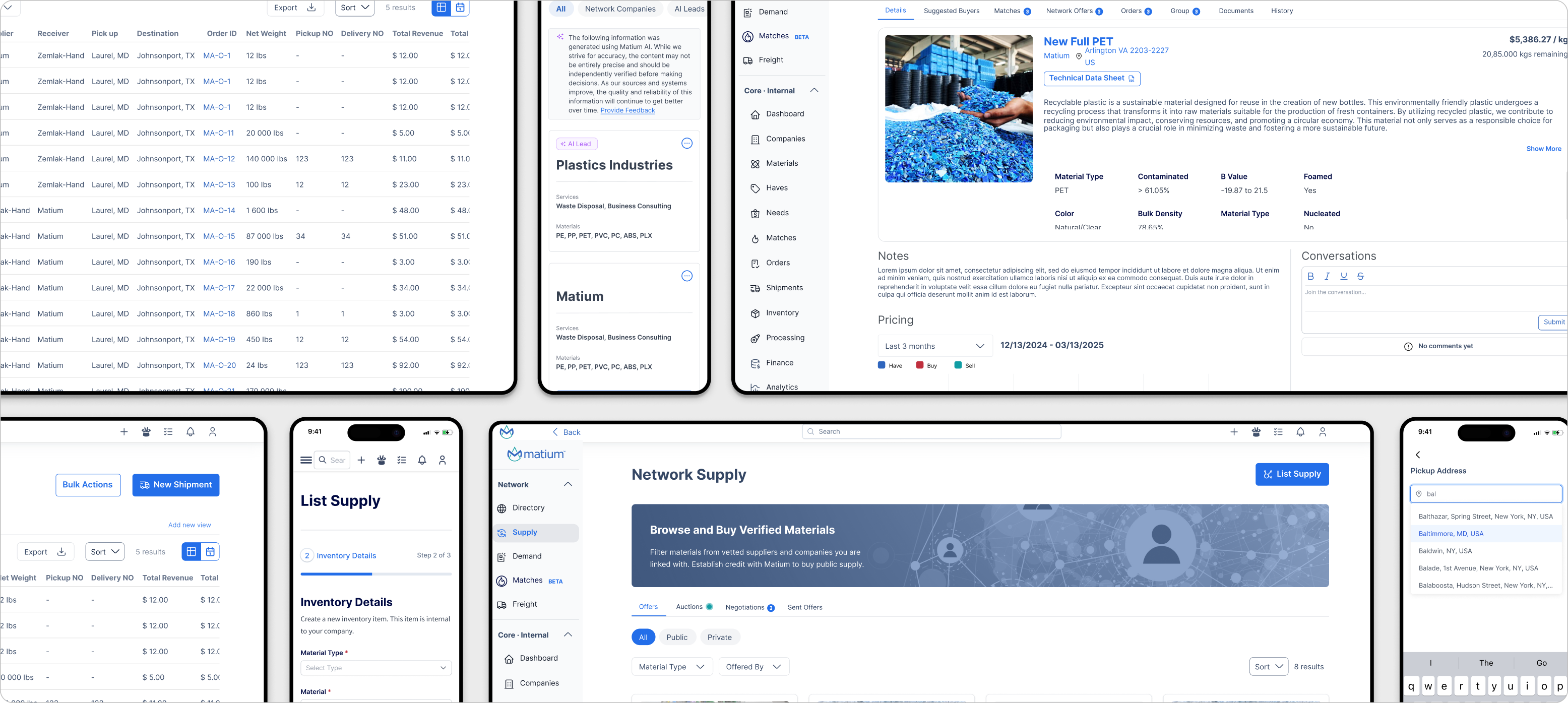
As Matium scaled rapidly, shipping auctions, AI features, and marketplace tools in parallel, the product interface began to fracture. Components diverged between design files and production. Typography, spacing, and patterns varied feature by feature. There was no shared foundation guiding how the product should look, feel, or behave.
I built Matium Matter to solve this at the infrastructure level. The system was not just a component library. It was a governance model: a set of shared standards, a process for keeping design and engineering aligned, and a foundation every team could build on without recreating decisions from scratch.
Beyond building the library, I ran monthly design system syncs, aligned on component standards with front-end engineering, and maintained Figma-to-Storybook parity across the platform. Matium Matter became the operating infrastructure for every feature shipped on the product.
Problem
As Matium scaled its product, the interface began to grow without a shared system behind it. New features were being designed and shipped quickly, but there was no centralized foundation to keep patterns, components, and visual decisions aligned across the platform.
Solution
A centralized design system built on three pillars: visual foundations, reusable components, and tight engineering alignment. One source of truth for every design and implementation decision across the platform, maintained in Figma and enforced in Storybook.
Establish a Unified Design Foundation
Create a shared system of visual foundations, tokens, and UI patterns that brings consistency to the product interface and serves as the single source of truth for both design and engineering.
Enable Scalable Product Development
Provide reusable components and structured patterns that let teams design and ship new features faster without sacrificing coherence or quality.
Strengthen Design and Engineering Alignment
Introduce a shared language between design and development through standardized components, tokens, and documentation, reducing implementation ambiguity and eliminating the back-and-forth that slows delivery.
Improve Interface Consistency
Ensure that common UI patterns behave and appear consistently across the platform, creating a predictable, intuitive experience for users regardless of which feature they are using.
As Matium continued to grow, the interface evolved without a shared system guiding it. Patterns, typography, spacing, and components varied depending on the page or feature. The product felt fragmented and was increasingly difficult to maintain at speed.
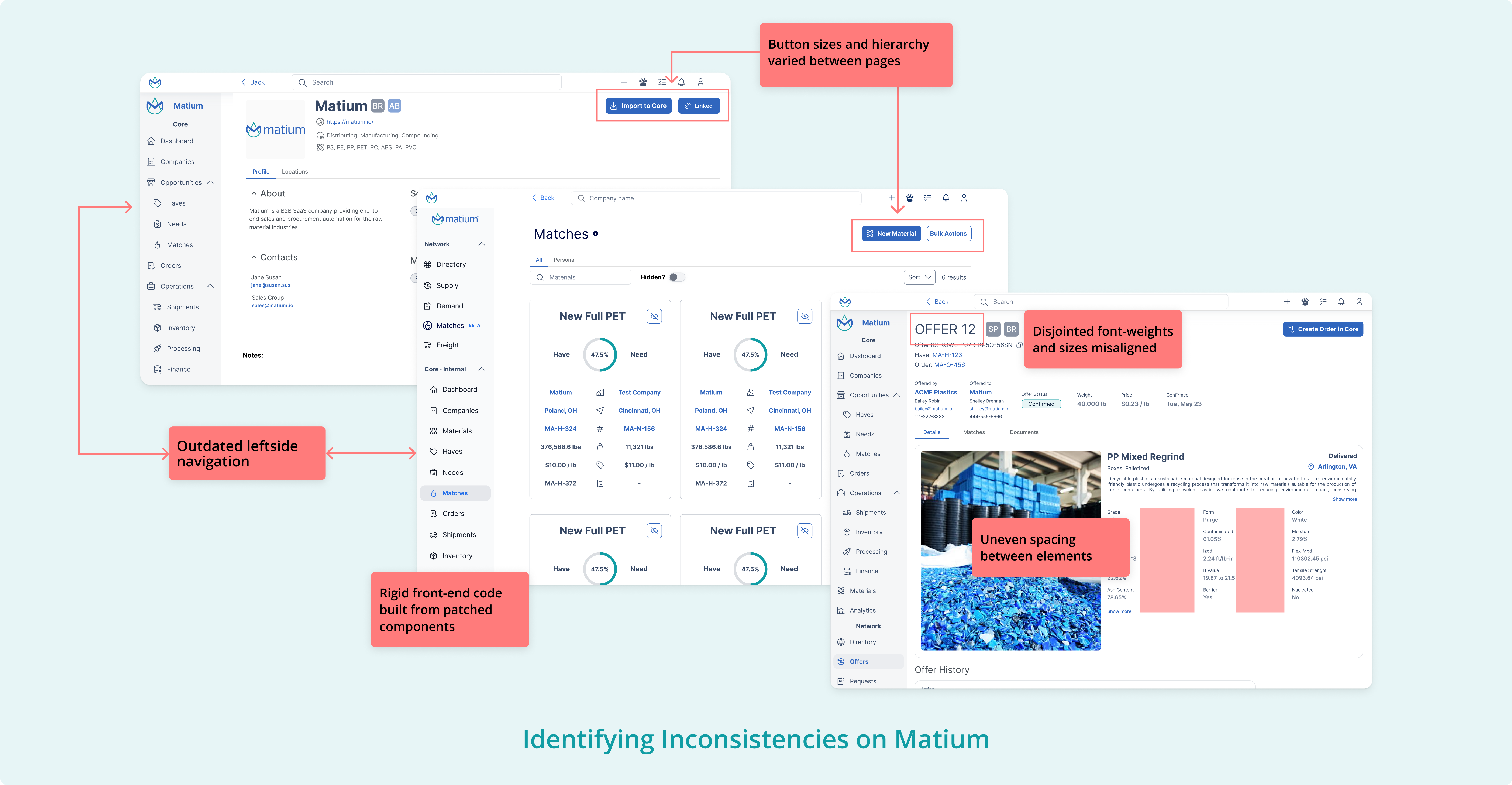
To understand the full scope of the problem, I conducted a product-wide audit, reviewing existing design files and production screens side by side. The audit surfaced outdated navigation patterns, misaligned typography, uneven spacing, and components implemented differently across different areas of the platform. This gave the team a shared understanding of the problem and a clear prioritization framework for what needed to be addressed first.
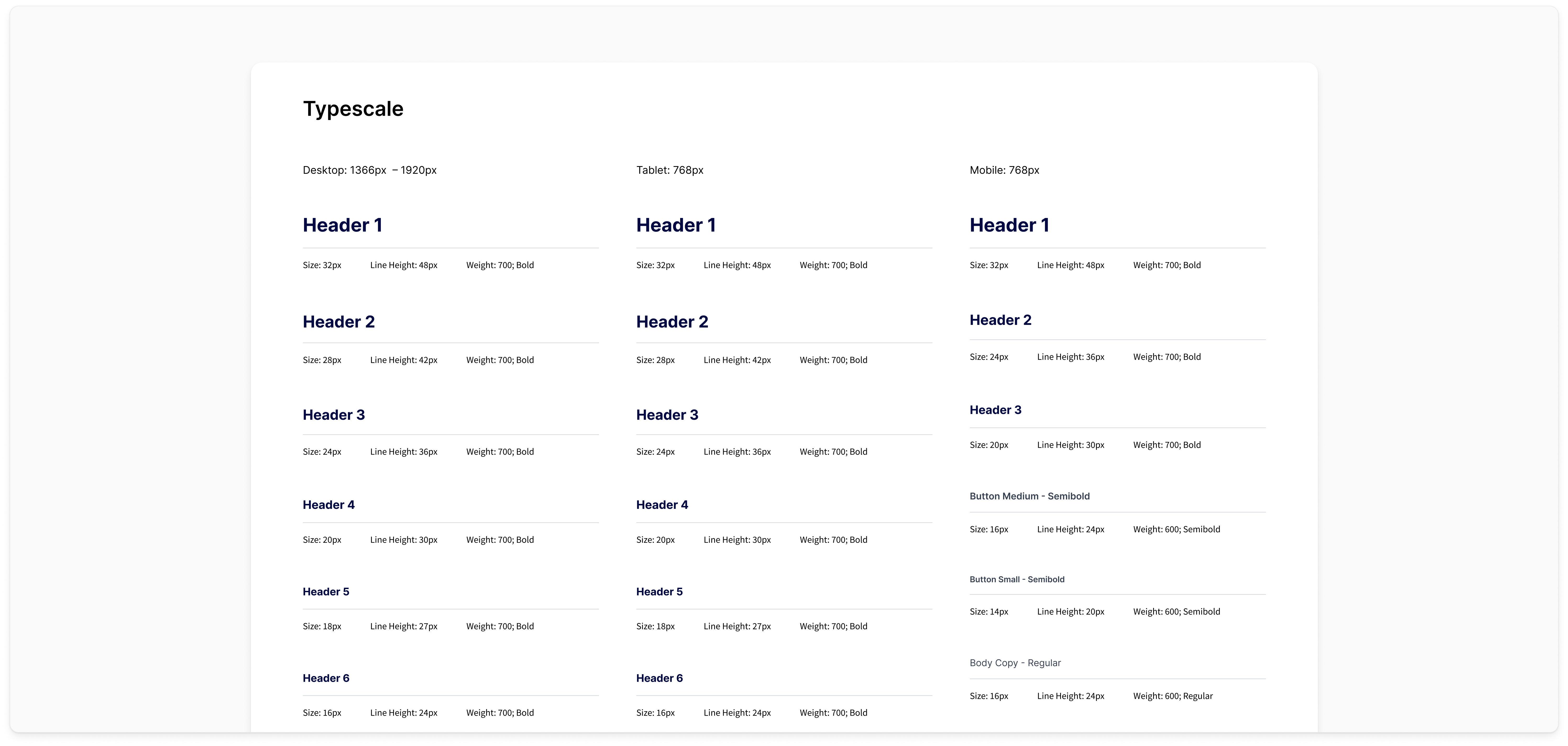
Establish System Foundations
I started by defining the core primitives: color, typography, spacing, and layout. These foundations created a consistent visual structure that every component and screen in the product could build on top of. Getting the foundations right first meant every subsequent decision had something stable to reference.
Build Reusable Components
With the foundations established, I developed a library of reusable UI components designed to support the most common patterns across the platform. This allowed new features to be designed and built more efficiently while maintaining consistency across the product.
Align With Engineering for Real-World Use
I worked closely with front-end engineers throughout the build, not just at handoff. Together, we identified which components needed to be built into the system first based on what was actively being developed, and aligned Figma components with their Storybook counterparts. Matium Matter was designed to work in production, not just as a design artifact.
Matium Matter was introduced as the foundation for how the product interface was designed and built across the platform. As new features were developed, teams began relying on the system's foundations and components to create consistent interfaces while reducing the need to recreate UI patterns from scratch.
By establishing a shared set of visual primitives and reusable components, Matium Matter enabled the product to scale more efficiently. Designers could build new experiences faster, and engineers had clearer patterns to implement, resulting in a more cohesive and maintainable product interface.
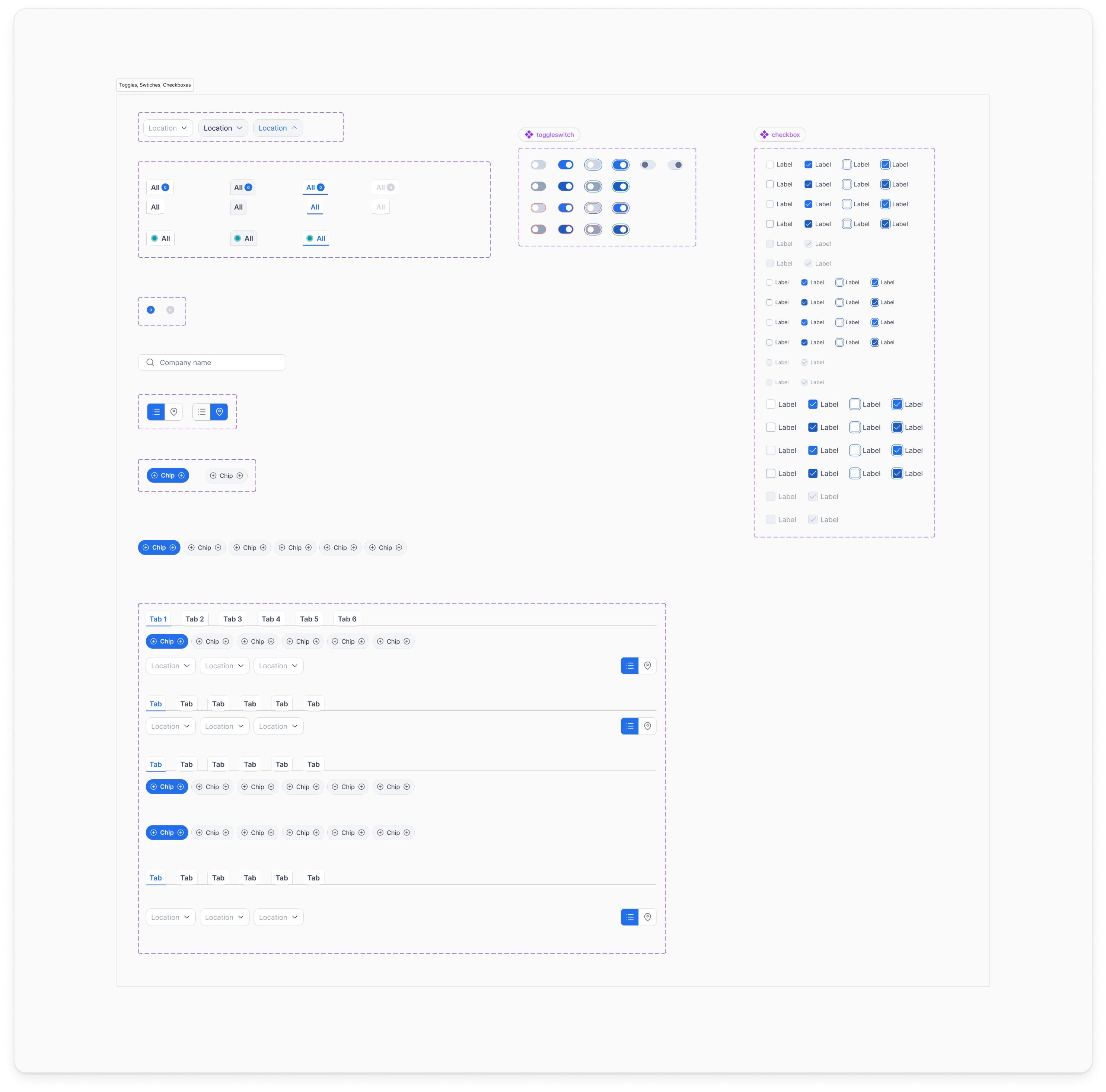
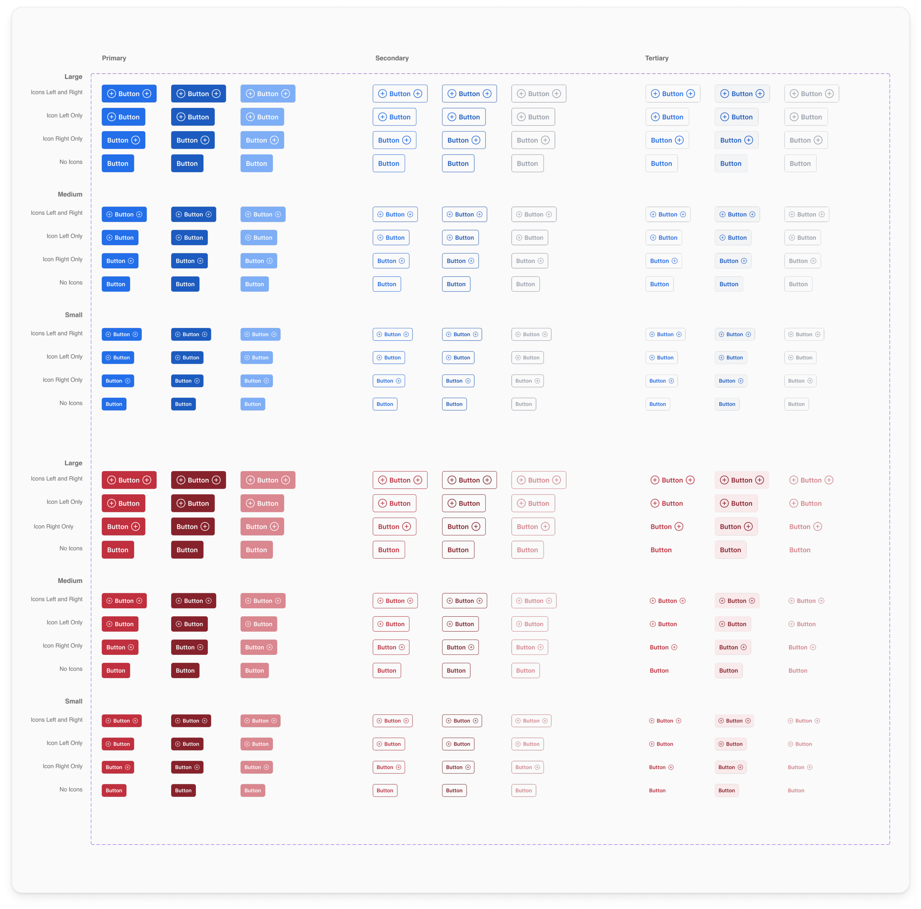
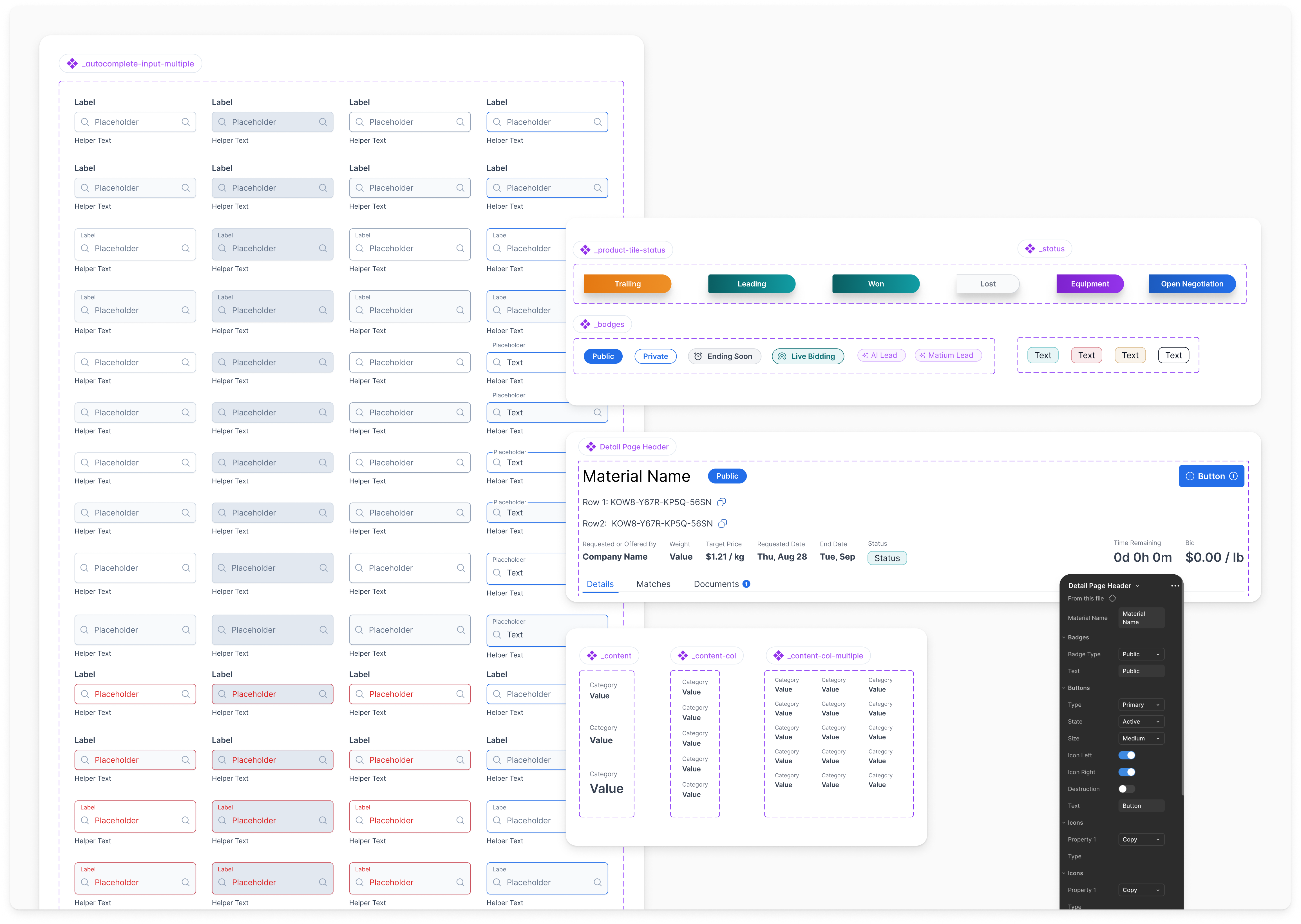
Matium Matter was structured using an atomic approach, breaking the interface into foundational elements, components, and composable patterns. This structure allowed complex interfaces to be assembled from smaller, reusable pieces while maintaining consistency across the product.
Keeping the Figma library and Storybook components in sync was the hardest part of this work, and the most important. Monthly design system syncs with front-end engineering kept both sides accountable and created a forum for resolving discrepancies before they became production issues. That collaboration is what made the system real rather than aspirational.
Matium Matter marked a turning point in how the product was built. By creating a unified design language and aligning Figma with Storybook, we gave every team a foundation they could trust and build on. The system accelerated delivery, reduced design-to-dev friction, and brought a more consistent, polished experience to Matium users.
What went well
The collaboration with front-end engineering was the most valuable part of this process. Running regular syncs and aligning on standards before building meant we eliminated discrepancies early rather than discovering them in production.
What could have been improved
Some legacy components remained in production because they were deeply tied to critical platform features. In future iterations, allocating dedicated time for refactoring legacy UI alongside new feature development would eliminate that technical debt faster and bring the full product into system compliance.